Warning! there are minor spoilers for my book Crystal Grave in this post.
In my time, I’ve brought at least a few books simply because their cover art intrigued me enough for me to take a look at the plot synopsis, then at the first few pages. The actual quality of the writing is still what secured the final purchase, but I can’t deny that the art played an important role. So, I wanted to make sure that my own novel’s art, the first impression it would make, was a quality one.
The first thing I did was decide what I wanted my cover art to depict. The story centers around two crystal knights, the young, rebellious Jasto and the traditionalist, veteran Epha, so I wanted both of them to be depicted. I also wanted to show an exciting scene, maybe not something in the middle of combat but right before it, to excite my readers with an unknown; specifically, how’s the battle going to go? Who will win, who will lose, what will change? Hopefully, they’re curious enough to give my story a read.
Fortunately, I realized there was a scene that fit my needs perfectly: Jasto and Epha, decked out in their photothyst armor, back to back and surrounded by sinister enemies. The first step was done.
But now I needed to decide something else: the style of my cover art. This is also something that tells readers a lot; for example, imagine this description for a cover: a man in dark clothes, holding a bloody knife, his back turned but looking over his shoulder. Already, you probably have some ideas about the content of this book.
Now imagine that the cover is all of those things, but is also a picture of a real person; a model who posed wearing the clothes and holding the knife. Next, imagine the opposite: the entire cover is monochrome, the man is just a simplistic black silhouette, and the only color present is the blood on the knife. It’s still the same thing being depicted, but the style probably changes what you assume the book will focus on.
To me, Crystal Grave is an attention-grabbing sci-fi battle novel with a unique combat system, and themes related to power, the pursuit of it, and the control of oneself. It’s not a hard sci-fi novel, bound closely to the physical laws of reality like Project Hail Mary. In fact this book is pretty fantastical, and the plotline could probably also be found in a shonen anime, so I want to convey that too.
On top of this, I wanted something that I would think looked cool. After some digging I found a good reference image, to explain the kind of style I was looking for to other artists: the cover art of the video game Omensight. It’s glowing, geometric, and very stylized, all things that appealed to me and lined up with a soft sci-fi feeling.
So, the next thing to do was find an artist to create my cover. I checked Fiverr, and talked with several artists (and a few people who just generated AI images) until I found someone who seemed to fit the task: Sadia Shahid, a cover art creator. After I gave her an explanation of what I was looking for, she sent back this rough sketch:
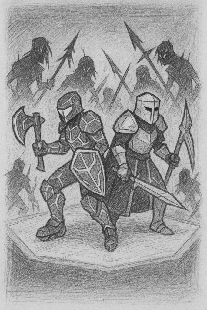
I liked the look of it, so I decided to proceed with Sadia. I asked her to proceed with this cover design, with some minor revisions, and the next cover she presented me with looked like this:
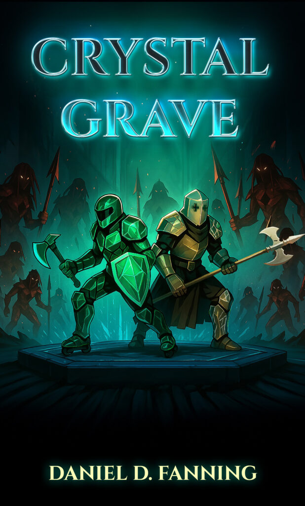
Awesome, but still needing some changes. Epha’s armor is the wrong color, and the cross-shaped holes for her eyes look blurry. I also took a look at the proportions of these characters and realized I wanted them to have less stocky bodies. In addition, I made one request that Sadia was quite accommodating with: I wanted to see the crystal knaves (the enemies surrounding Jasto and Epha) both with and without glowing eyes. She complied and presented me with two versions of the cover:
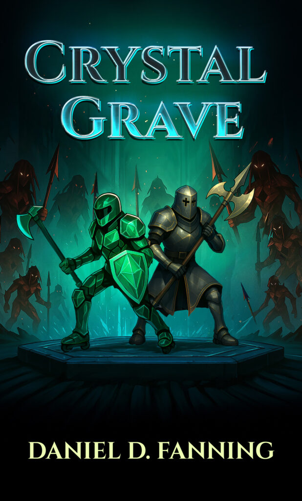

I decided to go with the glowing eyes, even if it’s technically a little less accurate to my lore. I also realized around this time that I’d forgotten to have Epha’s flechettes included in the cover art, but decided to keep going with the design as it was. With how much is going on in this cover, they might have cluttered things up.
The successive updates were just needed to correct the color of Epha’s halberd and to properly explain what I meant by ‘tabard,’ in reference to the tabard Epha wears. And before long, I had an excellent final product:
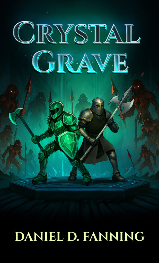
With that, the ebook version of my cover was completed. Jasto, in his angular and geometric armor and motorcycle-styled helmet, represents ‘the new way’ very clearly. Meanwhile Epha, in a traditionally shaped suit of plate and a dark tabard, stands for the old legacies of the crystal knights. Just as both of their characters do. I would later go back to Sadia Shahid and commission an expansion of this art, for the paperback and hardcover versions of Crystal Grave, but that’s a story for another post.
So, now you’ve gotten a glimpse of the cover art creation process, from the commissioner’s side of things. If you’re planning to self-publish a book, I hope you learned something useful! If not, I hope you still had fun reading this. Thanks for your time.
-Daniel Fanning
My first novel, Crystal Grave, will be available for purchase soon! You can already pre-order the electronic form on Amazon, but on January 23rd paperback and hardcover forms will be available too! You can check out the listing with the button below.